%20%20--%3E%0A%3Csvg%20version%3D%221.1%22%20xmlns%3D%22http%3A%2F%2Fwww.w3.org%2F2000%2Fsvg%22%20xmlns%3Axlink%3D%22http%3A%2F%2Fwww.w3.org%2F1999%2Fxlink%22%20x%3D%220px%22%20y%3D%220px%22%0A%09%20viewBox%3D%220%200%201092.7%20200%22%20style%3D%22enable-background%3Anew%200%200%201092.7%20200%3B%22%20xml%3Aspace%3D%22preserve%22%3E%0A%3Cstyle%20type%3D%22text%2Fcss%22%3E%0A%09.st0%7Bfill%3A%23231F20%3B%7D%0A%09.st1%7Bfill%3A%23293576%3B%7D%0A%09.st2%7Bfill%3A%23C82C2D%3B%7D%0A%09.st3%7Bfill%3A%23FFFFFF%3B%7D%0A%3C%2Fstyle%3E%0A%3Cg%20id%3D%22Template%22%3E%0A%3C%2Fg%3E%0A%3Cg%20id%3D%22Layer_2%22%3E%0A%09%3Cpolygon%20class%3D%22st3%22%20points%3D%2256.8%2C78.5%2073.1%2C78.5%2085.5%2C78.5%2085.5%2C36.3%2085.5%2C0%2068.8%2C0%2064.9%2C6.2%2063.3%2C8.7%2052%2C0%2025.5%2C0%2021.8%2C3.8%20%0A%09%092%2C23.8%202%2C176.2%2025%2C200%2061.5%2C200%2085.5%2C176.2%2085.5%2C121.5%2056.8%2C121.5%2056.8%2C176.2%2039.5%2C176.2%2039.5%2C32.4%2039.5%2C23.8%2056.8%2C23.8%2056.8%2C57.2%20%0A%09%09%09%22%2F%3E%0A%09%3Cpolygon%20class%3D%22st3%22%20points%3D%22143.9%2C104.2%20143.9%2C48.1%20143.9%2C24.2%20152.1%2C24.2%20153.2%2C24.2%20153.2%2C0%20152.1%2C0%20106.8%2C0%2093.9%2C0%2093.9%2C24.2%20%0A%09%09106.7%2C24.2%20106.7%2C63.4%20106.7%2C116.9%20106.7%2C175.8%20130.4%2C200%20169.2%2C200%20183%2C184.8%20191.2%2C175.8%20191.2%2C146.2%20191.2%2C96.1%20191.2%2C24.2%20%0A%09%09201.4%2C24.2%20201.4%2C0%20163.7%2C0%20158.7%2C0%20158.7%2C24.2%20163.7%2C24.2%20169.2%2C24.2%20169.2%2C75.2%20169.2%2C127.8%20169.2%2C174.1%20169.2%2C175.8%20%0A%09%09143.9%2C175.8%20143.9%2C152.9%20%09%22%2F%3E%0A%09%3Cpath%20class%3D%22st3%22%20d%3D%22M220.3%2C168v8.3h-10.5V200h62.1h12.7l28.5-23.8v-66l-5.2-5.1l-7.8-7.6l7.8-7.8l2.5-2.5V60V25.7%0A%09%09c0%2C0.7-8.6-7.9-25.7-25.7h-43H230h-20.2v23.8h10.5v96.7V168z%20M257.5%2C23.8h22.2v60.5h-22.2V23.8z%20M257.5%2C110.3h22.2v50.2v15.8h-22.2%0A%09%09v-29.4V110.3z%22%2F%3E%0A%09%3Cpath%20class%3D%22st3%22%20d%3D%22M331.9%2C176.2h-10.5v6V200h42.8h21.4h10.5l1-0.9l27.4-22.9v-56.9v-9.1l-13-12.8l10.3-10.2V25.7%0A%09%09c0%2C0.7-8.6-7.9-25.7-25.7h-74.8v23.8h10.5V45V176.2z%20M391.4%2C176.2h-5.8h-16.5v-66h22.2v17.9V176.2z%20M369.2%2C23.8h22.2v60.5H376h-6.9%0A%09%09v-5.6V23.8z%22%2F%3E%0A%09%3Cpolygon%20class%3D%22st3%22%20points%3D%22443.3%2C175.8%20433%2C175.8%20433%2C200%20463.5%2C200%20475%2C200%20489.5%2C200%20489.5%2C175.8%20480%2C175.8%20480%2C147.6%20%0A%09%09480%2C25.5%20489.5%2C25.5%20489.5%2C0%20433%2C0%20433%2C25.5%20443.3%2C25.5%20443.3%2C130.4%20%09%22%2F%3E%0A%09%3Cpolygon%20class%3D%22st3%22%20points%3D%22505.6%2C175.8%20497.9%2C175.8%20497.9%2C200%20541.3%2C200%20552.9%2C200%20583.6%2C200%20595.1%2C187.7%20595.1%2C153.9%20%0A%09%09595.1%2C140.7%20566.9%2C140.7%20566.9%2C159.5%20566.9%2C175.8%20542.6%2C175.8%20542.6%2C160.5%20542.6%2C115.8%20556.6%2C115.8%20556.6%2C133%20580.1%2C133%20%0A%09%09580.1%2C67.7%20556.6%2C67.7%20556.6%2C85%20542.6%2C85%20542.6%2C25.5%20566.9%2C25.5%20566.9%2C60.8%20595.1%2C60.8%20595.1%2C0%20497.9%2C0%20497.9%2C25.5%20505.6%2C25.5%20%0A%09%09505.6%2C155.6%20%09%22%2F%3E%0A%09%3Cpolygon%20class%3D%22st3%22%20points%3D%22682.8%2C73.5%20682.8%2C0%20669.5%2C0%20659%2C5.5%20652.7%2C0%20627.3%2C0%20603.5%2C24.2%20603.5%2C91.7%20628.1%2C116.2%20654.3%2C116.2%20%0A%09%09654.3%2C128.5%20654.3%2C176.2%20630.8%2C176.2%20630.8%2C140.6%20630.8%2C128.7%20604.5%2C128.7%20604.5%2C151%20604.5%2C200%20619.1%2C200%20625%2C200%20629.8%2C195.2%20%0A%09%09630.7%2C195.9%20637%2C200%20666.3%2C200%20687.5%2C176.2%20687.5%2C107.3%20687.5%2C106.8%20667%2C83%20635.5%2C83%20635.5%2C24.2%20656.8%2C24.2%20656.8%2C73.5%20%09%22%2F%3E%0A%09%3Cpolygon%20class%3D%22st2%22%20points%3D%22774%2C78.5%20774.8%2C78.5%20786.4%2C78.5%20802.8%2C78.5%20802.8%2C0.7%20802.8%2C0%20786%2C0%20780.5%2C8.7%20769.3%2C0%20742.8%2C0%20%0A%09%09719.3%2C23.8%20719.3%2C83.3%20719.3%2C176.2%20739%2C196.6%20742.3%2C200%20778.8%2C200%20802.8%2C176.2%20802.8%2C167%20802.8%2C121.5%20786.4%2C121.5%20774.8%2C121.5%20%0A%09%09774%2C121.5%20774%2C176.2%20756.8%2C176.2%20756.8%2C50.3%20756.8%2C23.8%20774%2C23.8%20774%2C33.1%20%09%22%2F%3E%0A%09%3Cpath%20class%3D%22st2%22%20d%3D%22M821.4%2C176.2h-10.2V200h11.2h45.8v-23.8h-6.5h-3v-65h5.5h11.7v7.6v47.7v9.7l14.7%2C23.3l0.3%2C0.4h25.2v-19v-4.8%0A%09%09h-5.5V140v-25.6l-13.3-13.3l-0.2-0.2l2.2-1.5l11.3-7.8v-2.5V24.2L882.4%2C0h-18.2h-11.6h-41.5v24.2h10.2v132.1V176.2z%20M858.7%2C24.2%0A%09%09h5.5h12.5V87h-12.5h-5.5V24.2z%22%2F%3E%0A%09%3Cpolygon%20class%3D%22st2%22%20points%3D%22934.8%2C166.2%20934.8%2C175.8%20924.5%2C175.8%20924.5%2C200%20981%2C200%20981%2C175.8%20971.5%2C175.8%20971.5%2C133.1%20%0A%09%09971.5%2C81.9%20971.5%2C25.5%20981%2C25.5%20981%2C9.1%20981%2C0%20942%2C0%20930.5%2C0%20924.5%2C0%20924.5%2C25.5%20930.5%2C25.5%20934.8%2C25.5%20934.8%2C119%20%09%22%2F%3E%0A%09%3Cpath%20class%3D%22st2%22%20d%3D%22M1089.9%2C87.2V25.7c0%2C0.6-6.4-5.8-19.3-19c-2-2.1-4.2-4.3-6.5-6.7h-31h-43.7v23.8h10.5v24.2v55.5v72.8h-10.5%0A%09%09V200h74.8l28.5-23.8v-66l-13-12.8L1089.9%2C87.2z%20M1059.4%2C176.2h-22.2v-66h22.2V176.2z%20M1059.4%2C84.2h-22.2V57.5V23.8h22.2V25V84.2z%22%0A%09%09%2F%3E%0A%3C%2Fg%3E%0A%3C%2Fsvg%3E%0A)

Chicago Cubs: Who has the best uniforms in the National League Central?

Uniforms are a major part of all professional sports. In the National League Central, do the Chicago Cubs come out on top in terms of their threads? Yes.
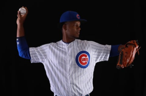
1. Chicago Cubs
This may be a little biased, but it’s a Chicago Cubs-based website, sue us. The home whites are a classic look. The pinstripes with the blue numbers and red outline is a perfect look. Who doesn’t like the logo on the top right of the uniform? It works for the Yankees and it works for the Cubs, too.
Hey, speaking of upper jersey logos – the blue road alternates have a great logo. A cub sitting perched on the red C the Cubs use in their logo. The red numbers give an excellent contrast to the blue. One underrated part of this uniform is the little Cubs logo is snuck onto the top of the pants. Subtle, but a nice touch. The names and numbers on both of the uniforms are both very easy to read, which is important in a uniform.
The Cubs’ last uniform is the road grays. These are still nice, but not as cool as the other two. The “CHICAGO” across the front is different from the other two, which keeps things fresh. This jersey has red numbers, with blue names. On the road, the Cubs wear the blue alternates way more than the road grays, and they make a good choice when doing so.

2. Cincinnati Reds
The Reds might have the most underrated uniforms in baseball, especially the alternates. The home red alternate uniform has the perfect color scheme. A red jersey with white numerals and lettering and a red hat. White is really the only contrast color here that would look good, and it looks great.
More from Cubbies Crib
- Cubs should keep close eye on non-tender candidate Cody Bellinger
- Cubs starting pitching has been thriving on the North Side
- Make no mistake: the Cubs are very much about power hitters
- Cubs are giving pitcher Javier Assad a deserved shot
- Cubs: It’s time to start thinking about potential September call-ups
Another logo-in-the-corner jersey, and we here at Cubbies Crib are fond of those. What really adds to this is the number on the bottom half of the jersey, diagonal from the logo. This is simple, yet creative. It’s a pretty uniform.
The home whites for Cincinnati are the reverse of the red alternate, and they look just as good. Cincinnati’s uniforms aren’t talked about much, and that’s a shame, because they should be. Let’s face it, does Joey Votto look that good in any other uniform? The answer is absolutely not.
The other Reds’ uniform is the road gray. A common theme here is that the road grays are boring. Cincy’s isn’t boring, it just doesn’t match up at all with the other two. The script “Cincinnati” across the front, while different, is standard for most road gray uniforms. What is cool about this particular set is the hat.
The hat is red, but a black bill. The black bill really adds a nice touch. It helps that black is an accent color and goes with anything, but that hat just looks nice. The good thing is they could wear that with any of their jerseys and it would work.
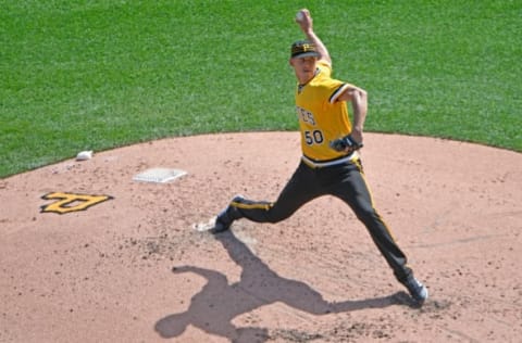
3. Pittsburgh Pirates
It was a spirited debate here at Cubbies Crib headquarters as to who was second and third. We really need to replace the drywall in the break room later. Where were we? Ah, yes, Pirates. The Sunday home alternates take the cake here. We are partial to colored pants, always. The home alternates are a throwback to the 1970s. The yellow top with the black pants and the three striped hat. There is not one thing wrong with these jerseys.
Next is the standard black alternate. It’s another logo-on-the-top-corner of the uniform, with a number diagonal down the uniform a little. A really underrated element of the Pirates’ uniforms as a hole is the font. The pointed letters just looks like a font that a Pirate would use, so that’s a nice play on their brand.
The pointy letters are the only uniform in baseball that has something so unique. Pittsburgh may not be the best team, but at least they will look cool on the field. Not to mention PNC is beautiful, so they’ve got that going for them, which is nice.

The home whites and road grays come in as a tie, because there is no bad Pirate uniform. All they need now is to warm up in full pirate garb. Pirate hats, eye patches, leather clothing and take batting practice with swords and weapons rather than bats. Just really fully embrace that pirate culture.
Hey, MLB, can we get this medically cleared?
We here at Cubbies Crib would prefer not to be held liable for injuries from this genius idea.

4. Milwaukee Brewers
The Brewers color scheme makes it hard for them to have a good uniform. But, to pick their best, the Friday night home throwbacks. The lighter blue and the pinstripes give a nice referesher from the traditional navy blue and wheat gold. As for the normal uniforms, the navy blue jersey is our pick. Looking at those uniforms, the gold shines and it really shows in the bright sun.
The home whites and road grays round out their combos, and they all look the same. Cursive writing with wheat underneath the writing, representing the beer for Brewer. That’s a creative touch, but it would be nice if they mixed their uniforms up a little.
However, using their throwback logo from time to time has been a blast from the past. The “MB” in the shape of a hand and glove is really creative, and many, including us, think that logo should be bought back to the Brewers full time.
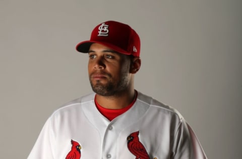
5. St. Louis Cardinals
Aside from the Los Angeles Dodgers, this is the most boring uniform in baseball. The home whites and road grays look exactly the same. There is a large amount of red and not a whole lot of anything else. On the road grays, they used to wear navy blue hats, but eliminated those in favor of the red hats worn with everything else.
Next: Pitching matchups, what to watch for in Miami this weekend
The Cards do have a really nice looking Saturday home alternate uniform, however. It is cream colored, and is a fauxback, not quite a throwback, but an honor to the Cardinals tradition. These are the first uniforms to say “St. Louis” across the front since 1932. These are pretty sharp, and would get the nod for our favorite Cardinals uniform.