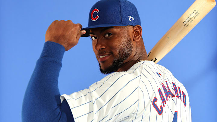
Another day, another glaring example of how many corner were clearly cut by Nike in the rollout of the new MLB jerseys. We've seen plenty of images already during spring training demonstrating a product that looks, simply, cheap and half-cooked, but one of the worst I've seen comes courtesy of Cubs outfield prospect Alexander Canario.
Canario, who got his first taste of big league action with Chicago last year, wears the number 4. And apparently, Nike couldn't even be bother to center his number on his new jersey.
For all of the people who are like "these jerseys look the same to me." They are not close.
— Sara Sanchez (@BCB_Sara) February 24, 2024
Alexander Canario in 2023 and 2024. Come on now, MLB, this is trash and we all have eyes.
(📸 @Razzball for the screengrab from today's game & Getty for the 2023 image) pic.twitter.com/fiGrn40qD7
Cubs fans can hope for changes to the new uniforms - but don't hold your breath
The spacing of the letters on his last name seems exaggerated and, like I said, at least from this screen grab, it doesn't even look like the number is centered on the jersey. Despite the lower quality, Nike and MLB have no chances charging more than ever on team sites and MLB.com for jerseys - and you have to imagine sales are going to crater out barring some major tweaks being made.
It's really unfortunate that instead of talking about the excitement about baseball returning and a new season being at hand, we're wasting so much time talking about something that the league and Nike should have handled with more care and attention before turning the game on its head with their missteps.
I wish I was just talking about how sick the spring training hats are - or the decision to remove the trademark symbol from the Cubs' chest logo on their home whites. Simpler times, am I right? Instead, the league-wide discontent with how the jerseys and pants look and feel continues to grow and it seems unlikely we get any real solution from the league anytime soon.
