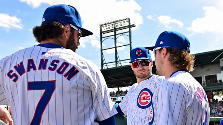
It's been a roller coaster when it comes to Cubs uniforms this spring. We have the high of a spring training hat that ranks among the best in the league - as well as a number of lows, including a very un-Cubbie-like blue being used, pants that don't fit, names that aren't centered and, well, you get the idea.
I keep saying that, hopefully, I'm done writing about uniforms. But the universe cares not for my wishes. Me writing this piece as I sit on the train proves as much. Thankfully, though, this latest update and change to Cubs uniforms is easy to accept and shouldn't rile folks up too much.
According to Paul Lukas at UniWatch, Chicago has updated the number styling on the backs of their uniforms this spring. Now, before you get all bent out of shape and fired up at Nike, here's the interesting bit: for the first time in over three decades, the numbers we're seeing on the field actually match what's in the MLB Style Guide for the club.
Changes continue to mount on Cubs' jerseys - especially home whites
Please, please, go check out Lukas' piece on this because it's incredibly detailed and I found myself slipping deeper and deeper down the rabbit hole reading (in the best way imaginable). But the long and short of it is the Cubs have ditched a more rounded number style to one that instead relies on more squared-off numbers.
Again, in the grand scheme of things, it's a thing that - had it not been pointed out - I don't know that I would've ever noticed. I definitely didn't see the new style during the first few Cactus League games and immediately see a major difference. But, then again, the much-smaller lettering used for player names definitely distracted me and likely would have continued to do so.
So, another day, another change to the Cubs' uniforms - which have also dropped the trademark logo that's been a staple on the chest logo of the team's home whites for some time. But, all told, it doesn't change the overall appearance of the uniform all that much and, amidst a sea of jersey chaos, shouldn't be a major issue for anyone moving forward.
