%20%20--%3E%0A%3Csvg%20version%3D%221.1%22%20xmlns%3D%22http%3A%2F%2Fwww.w3.org%2F2000%2Fsvg%22%20xmlns%3Axlink%3D%22http%3A%2F%2Fwww.w3.org%2F1999%2Fxlink%22%20x%3D%220px%22%20y%3D%220px%22%0A%09%20viewBox%3D%220%200%201092.7%20200%22%20style%3D%22enable-background%3Anew%200%200%201092.7%20200%3B%22%20xml%3Aspace%3D%22preserve%22%3E%0A%3Cstyle%20type%3D%22text%2Fcss%22%3E%0A%09.st0%7Bfill%3A%23231F20%3B%7D%0A%09.st1%7Bfill%3A%23293576%3B%7D%0A%09.st2%7Bfill%3A%23C82C2D%3B%7D%0A%09.st3%7Bfill%3A%23FFFFFF%3B%7D%0A%3C%2Fstyle%3E%0A%3Cg%20id%3D%22Template%22%3E%0A%3C%2Fg%3E%0A%3Cg%20id%3D%22Layer_2%22%3E%0A%09%3Cpolygon%20class%3D%22st3%22%20points%3D%2256.8%2C78.5%2073.1%2C78.5%2085.5%2C78.5%2085.5%2C36.3%2085.5%2C0%2068.8%2C0%2064.9%2C6.2%2063.3%2C8.7%2052%2C0%2025.5%2C0%2021.8%2C3.8%20%0A%09%092%2C23.8%202%2C176.2%2025%2C200%2061.5%2C200%2085.5%2C176.2%2085.5%2C121.5%2056.8%2C121.5%2056.8%2C176.2%2039.5%2C176.2%2039.5%2C32.4%2039.5%2C23.8%2056.8%2C23.8%2056.8%2C57.2%20%0A%09%09%09%22%2F%3E%0A%09%3Cpolygon%20class%3D%22st3%22%20points%3D%22143.9%2C104.2%20143.9%2C48.1%20143.9%2C24.2%20152.1%2C24.2%20153.2%2C24.2%20153.2%2C0%20152.1%2C0%20106.8%2C0%2093.9%2C0%2093.9%2C24.2%20%0A%09%09106.7%2C24.2%20106.7%2C63.4%20106.7%2C116.9%20106.7%2C175.8%20130.4%2C200%20169.2%2C200%20183%2C184.8%20191.2%2C175.8%20191.2%2C146.2%20191.2%2C96.1%20191.2%2C24.2%20%0A%09%09201.4%2C24.2%20201.4%2C0%20163.7%2C0%20158.7%2C0%20158.7%2C24.2%20163.7%2C24.2%20169.2%2C24.2%20169.2%2C75.2%20169.2%2C127.8%20169.2%2C174.1%20169.2%2C175.8%20%0A%09%09143.9%2C175.8%20143.9%2C152.9%20%09%22%2F%3E%0A%09%3Cpath%20class%3D%22st3%22%20d%3D%22M220.3%2C168v8.3h-10.5V200h62.1h12.7l28.5-23.8v-66l-5.2-5.1l-7.8-7.6l7.8-7.8l2.5-2.5V60V25.7%0A%09%09c0%2C0.7-8.6-7.9-25.7-25.7h-43H230h-20.2v23.8h10.5v96.7V168z%20M257.5%2C23.8h22.2v60.5h-22.2V23.8z%20M257.5%2C110.3h22.2v50.2v15.8h-22.2%0A%09%09v-29.4V110.3z%22%2F%3E%0A%09%3Cpath%20class%3D%22st3%22%20d%3D%22M331.9%2C176.2h-10.5v6V200h42.8h21.4h10.5l1-0.9l27.4-22.9v-56.9v-9.1l-13-12.8l10.3-10.2V25.7%0A%09%09c0%2C0.7-8.6-7.9-25.7-25.7h-74.8v23.8h10.5V45V176.2z%20M391.4%2C176.2h-5.8h-16.5v-66h22.2v17.9V176.2z%20M369.2%2C23.8h22.2v60.5H376h-6.9%0A%09%09v-5.6V23.8z%22%2F%3E%0A%09%3Cpolygon%20class%3D%22st3%22%20points%3D%22443.3%2C175.8%20433%2C175.8%20433%2C200%20463.5%2C200%20475%2C200%20489.5%2C200%20489.5%2C175.8%20480%2C175.8%20480%2C147.6%20%0A%09%09480%2C25.5%20489.5%2C25.5%20489.5%2C0%20433%2C0%20433%2C25.5%20443.3%2C25.5%20443.3%2C130.4%20%09%22%2F%3E%0A%09%3Cpolygon%20class%3D%22st3%22%20points%3D%22505.6%2C175.8%20497.9%2C175.8%20497.9%2C200%20541.3%2C200%20552.9%2C200%20583.6%2C200%20595.1%2C187.7%20595.1%2C153.9%20%0A%09%09595.1%2C140.7%20566.9%2C140.7%20566.9%2C159.5%20566.9%2C175.8%20542.6%2C175.8%20542.6%2C160.5%20542.6%2C115.8%20556.6%2C115.8%20556.6%2C133%20580.1%2C133%20%0A%09%09580.1%2C67.7%20556.6%2C67.7%20556.6%2C85%20542.6%2C85%20542.6%2C25.5%20566.9%2C25.5%20566.9%2C60.8%20595.1%2C60.8%20595.1%2C0%20497.9%2C0%20497.9%2C25.5%20505.6%2C25.5%20%0A%09%09505.6%2C155.6%20%09%22%2F%3E%0A%09%3Cpolygon%20class%3D%22st3%22%20points%3D%22682.8%2C73.5%20682.8%2C0%20669.5%2C0%20659%2C5.5%20652.7%2C0%20627.3%2C0%20603.5%2C24.2%20603.5%2C91.7%20628.1%2C116.2%20654.3%2C116.2%20%0A%09%09654.3%2C128.5%20654.3%2C176.2%20630.8%2C176.2%20630.8%2C140.6%20630.8%2C128.7%20604.5%2C128.7%20604.5%2C151%20604.5%2C200%20619.1%2C200%20625%2C200%20629.8%2C195.2%20%0A%09%09630.7%2C195.9%20637%2C200%20666.3%2C200%20687.5%2C176.2%20687.5%2C107.3%20687.5%2C106.8%20667%2C83%20635.5%2C83%20635.5%2C24.2%20656.8%2C24.2%20656.8%2C73.5%20%09%22%2F%3E%0A%09%3Cpolygon%20class%3D%22st2%22%20points%3D%22774%2C78.5%20774.8%2C78.5%20786.4%2C78.5%20802.8%2C78.5%20802.8%2C0.7%20802.8%2C0%20786%2C0%20780.5%2C8.7%20769.3%2C0%20742.8%2C0%20%0A%09%09719.3%2C23.8%20719.3%2C83.3%20719.3%2C176.2%20739%2C196.6%20742.3%2C200%20778.8%2C200%20802.8%2C176.2%20802.8%2C167%20802.8%2C121.5%20786.4%2C121.5%20774.8%2C121.5%20%0A%09%09774%2C121.5%20774%2C176.2%20756.8%2C176.2%20756.8%2C50.3%20756.8%2C23.8%20774%2C23.8%20774%2C33.1%20%09%22%2F%3E%0A%09%3Cpath%20class%3D%22st2%22%20d%3D%22M821.4%2C176.2h-10.2V200h11.2h45.8v-23.8h-6.5h-3v-65h5.5h11.7v7.6v47.7v9.7l14.7%2C23.3l0.3%2C0.4h25.2v-19v-4.8%0A%09%09h-5.5V140v-25.6l-13.3-13.3l-0.2-0.2l2.2-1.5l11.3-7.8v-2.5V24.2L882.4%2C0h-18.2h-11.6h-41.5v24.2h10.2v132.1V176.2z%20M858.7%2C24.2%0A%09%09h5.5h12.5V87h-12.5h-5.5V24.2z%22%2F%3E%0A%09%3Cpolygon%20class%3D%22st2%22%20points%3D%22934.8%2C166.2%20934.8%2C175.8%20924.5%2C175.8%20924.5%2C200%20981%2C200%20981%2C175.8%20971.5%2C175.8%20971.5%2C133.1%20%0A%09%09971.5%2C81.9%20971.5%2C25.5%20981%2C25.5%20981%2C9.1%20981%2C0%20942%2C0%20930.5%2C0%20924.5%2C0%20924.5%2C25.5%20930.5%2C25.5%20934.8%2C25.5%20934.8%2C119%20%09%22%2F%3E%0A%09%3Cpath%20class%3D%22st2%22%20d%3D%22M1089.9%2C87.2V25.7c0%2C0.6-6.4-5.8-19.3-19c-2-2.1-4.2-4.3-6.5-6.7h-31h-43.7v23.8h10.5v24.2v55.5v72.8h-10.5%0A%09%09V200h74.8l28.5-23.8v-66l-13-12.8L1089.9%2C87.2z%20M1059.4%2C176.2h-22.2v-66h22.2V176.2z%20M1059.4%2C84.2h-22.2V57.5V23.8h22.2V25V84.2z%22%0A%09%09%2F%3E%0A%3C%2Fg%3E%0A%3C%2Fsvg%3E%0A)

Ranking the Chicago Cubs modern uniforms, from worst to best


The Chicago Cubs are one of the oldest franchises in Major League Baseball – and, by and large, their uniforms have always reflected that. In the last decade, we saw the team celebrate its century-plus of history in exciting ways, donning throwbacks from different eras, but heading into 2022, it’s back primarily to three looks – with the City Connect looks from this past year returning, as well.
The introduction of those alternate navy blue threads irked baseball traditionalists – but the numbers speak for themselves in terms of sales. But how do they rank among the four options the Cubs cycle through? Let’s take a look and see.
Ranking Chicago Cubs uniforms: #4 – The boring road grays just kill me
If you want traditional, then you’re probably a big fan of the team’s road look. A gray top with ‘CHICAGO’ in block letters across the chest along with the player’s number below and on the back, accompanied by their last name is about as safe as you can get.
I will say – they’re better than those ill-fated alternate grays we saw back in 2014 that had ‘CUBS’ across the chest instead of ‘CHICAGO’ – but that’s setting the bar awfully low, too. Those might have been among the worst jerseys ever. Thankfully, they only lasted a couple years.
I’d love to see the team bring back the angry bear look from the 1980s in some fashion, even if it’s just replacing the alternate logo on the left sleeve. I get that road grays are a part of baseball history and have a special place in fans’ hearts, but, come on – we can do better here.
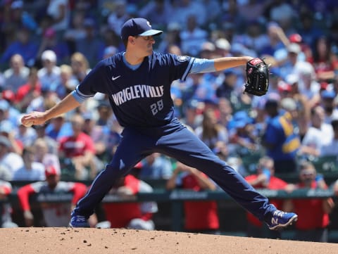
Ranking Chicago Cubs uniforms: #3 – City Connect look is better than you think
Like everything else in today’s world, Major League Baseball’s decision to introduce City Connect uniforms in 2021 was polarizing, to say the least. Those aforementioned traditionalists saw it as a bastardization of the game – but, like I said, the sales spoke for themselves.
The seven teams – including the Cubs – who donned the new threads last year will carry them forward into 2022, and by the end of 2023, the rest of the league will have them, as well.
“They’re getting a little more aggressive where they’ve been a little more traditional,” MLB chief revenue officer Noah Garden told ESPN. “They see what’s happened. They see the conversation that’s out there. They see the overwhelming positive support and they see it attracting an audience they want to attract, which is a younger demographic that is more fashion forward, loves the game, but may not be as traditional.”
At first, I wasn’t a huge fan of the Cubs’ City Connect uniforms – but as the season went on and I spent more and more Fridays at Wrigley, I really came around on them. Navy is a seriously underutilized colorway as far as I’m concerned and I’ve always loved some of the alternate looks on apparel and gear featuring the navy and cream color combination you can get around the ballpark.
Throw in that signature Chicago sky blue color, the familiar arch of the marquee incorporated into the ‘WRIGLEYVILLE’ across the chest, the subtle nods to the city in the details and you have yourselves a quality on-field look.
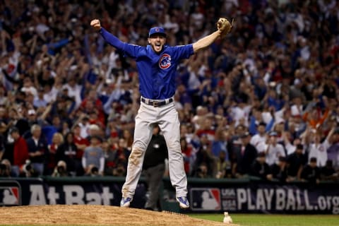
Ranking Chicago Cubs uniforms: #2 – A look forever tied to that magical 2016
Maybe it’s nostalgia at this point, but the team’s royal blue alternates seem to have gained serious market share since 2016. It’s hard to not love a look that your team donned while erasing a 108-year World Series championship drought, really.
The image above, Kris Bryant leaping in jubilation, is etched into the memories of Cubs fans forever. On a cold, dreary night in Cleveland, these threads really popped – with the blue hat pairing perfectly with the alternate logo boldly stitched onto the left side of the chest.
Of course, the World Series patch on the sleeve didn’t hurt matters.
But in all seriousness, I’ve always loved the clean look of the all-gray pants (with the small Cubs logo on the hip) with these tops. They’re immeasurably more aesthetically pleasing than the road grays and if the Cubs swapped these for the grays away from Wrigley moving forward, needless to say I wouldn’t complain one bit.
The one way it could be improved (and this goes for all the team’s traditional looks) – bring back the red-billed hats. Give the people what they want.
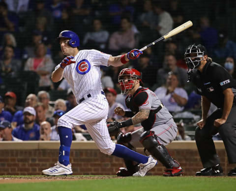
Ranking Chicago Cubs uniforms: #1 – Give me pinstripes till the day I die
Pinstripes forever.
Seriously, name one uniform in the league with pinstripes that isn’t a banger. The Cubs have rocked pinstripes for decades and they’ve become intertwined with the game day experience at the Friendly Confines.
The stark white tops and bottoms give a clean look with the thin royal pinstripes tying it all together. There’s nothing better than watching your favorite player make an all-out diving grab on a summer afternoon at the ballpark, and watching them run back into the dugout with grass and dirt stains all over these threads.
Next. Ranking the 25 greatest Cubs players of all-time. dark
I’d still like to see more of a nod to the 80s home whites, with added piping and the angry bear – but at this point, I know that’s my personal bias. These uniforms – as is – are among the best in baseball, a timeless vibe that’s aged incredibly well, even as the game and even Wrigley has changed over the years.