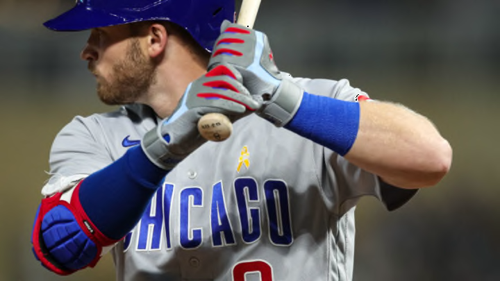
Ranking Chicago Cubs uniforms: #2 – A look forever tied to that magical 2016
Maybe it’s nostalgia at this point, but the team’s royal blue alternates seem to have gained serious market share since 2016. It’s hard to not love a look that your team donned while erasing a 108-year World Series championship drought, really.
The image above, Kris Bryant leaping in jubilation, is etched into the memories of Cubs fans forever. On a cold, dreary night in Cleveland, these threads really popped – with the blue hat pairing perfectly with the alternate logo boldly stitched onto the left side of the chest.
Of course, the World Series patch on the sleeve didn’t hurt matters.
But in all seriousness, I’ve always loved the clean look of the all-gray pants (with the small Cubs logo on the hip) with these tops. They’re immeasurably more aesthetically pleasing than the road grays and if the Cubs swapped these for the grays away from Wrigley moving forward, needless to say I wouldn’t complain one bit.
The one way it could be improved (and this goes for all the team’s traditional looks) – bring back the red-billed hats. Give the people what they want.
