Ranking the six best Chicago Cubs uniforms of all-time

Ernie Banks, Chicago Cubs (Photo by Chris McGrath/Getty Images)
1 of 6
Next
(Photo by David Banks/Getty Images)
(Photo by David Banks/Getty Images) /

When your team has been playing baseball for over 100 years, you rack up the uniform count. Here are, in my opinion, the best Chicago Cubs threads.

1969 is a year to both remember and forget in the minds of many Chicago Cubs fans of a certain age. Heck, even if you weren’t around in ’69, you probably feel the heartache and disappointment from that year. However, one thing you shouldn’t want to forget from that season is the iconic jersey the Cubs wore that season. Make that two iconic jerseys.

Lumping them together because they were both awesome, the home and away jerseys from 1969 are looks the Cubs could easily bring back for single games (like the Schwarber walk-off game from July 17) or just switch to them for an entire season. They could also make them alternate jerseys; they’d make more money off merchandise and raise more money for charities through their auctions.

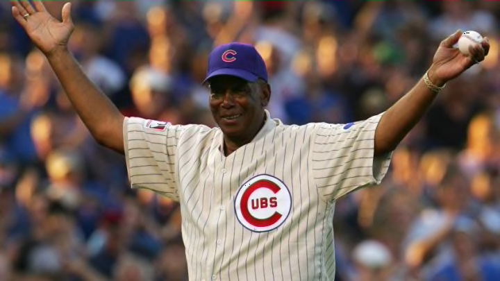
These ’69 jerseys are iconic because they’re classy and simple. Featuring the blue circled Cubs logo on the left chest, the home jersey has a big red “C” with uppercase “UBS” inside. All of that is on a white patch that looks simple and elegant. The blue and yellow cubbie bear from that era adorns the left sleeve, while the MLB patch sits on the right sleeve. Obviously, the Cubs could add a different patch there and put the MLB logo on the back of the neck, or keep it that way.

The road greys from ’69 have the same exact patches as the home version, but they also feature blue numbers on the lower left stomach with “CHICAGO” featured boldly across the chest. The heather gray road uniforms look like an iconic away jersey from the first half of the 20th century and would be a huge upgrade on either road jersey the team sports now.
(Photo by Mitchell Leff/Getty Images)
(Photo by Mitchell Leff/Getty Images) /

Chicago Cubs: Arrieta seemingly got to wear all the cool jerseys

1968 was a pretty unremarkable season for the Cubs as they finished 84-78 in third place in the National League. What was remarkable, though, was their jerseys. One of the sharpest uniforms you’ll ever see the Cubs sport, the team’s 1968 road jerseys ooze power and confidence. Or maybe it was just the way Jake Arrieta wore it. Or, better yet, the way “Mr. Cub” Ernie Banks before him.

The ’68 road jersey is a pretty simple jersey, but starkly different from the version the Cubs would wear just a year later. Gray, but seemingly a bit darker than the ’69 heather version, the ’68 option included red and blue piping down the pants, as well as that same red and blue trim piping adorning the neck and sleeves.

The “CHICAGO” block lettering across the chest features the exact same color scheme and makes the letters stand out. There were no numbers on the front, but the back number has the same color combination.

They featured two pretty cool patches as well-  the classic cubbie bear design on the left sleeve and a sesquicentennial patch for the state of Illinois (founded in 1818) on the right. This 1968 jersey was worn in 2014 but hasn’t made much of an appearance since.

This jersey would be a neat everyday appearance, but would serve the Cubs much better as a once a year deal as they’re bold and would stick out to fans and players alike.

(Photo by Stacy Revere/Getty Images)
(Photo by Stacy Revere/Getty Images) /

Chicago Cubs: Rizzo looks good in the ’16 digs

On July 6, 2016, the Cubs and Reds played a turn back the clock game and both rocked their 1916 uniforms. I’d be cool with this once a week, quite frankly. Both the uniforms looked sharp, the modern materials, cuts, and fits mean players can’t gripe, and it’s a completely distinct look for the Chicago Cubs.

Similar to the equally cool 1915 Chicago Whales jerseys that the Cubs sported in 2015, the ’16 Cubs jerseys featured the big red (outlined in blue) “C” surrounding an animal logo. In this case, it was the four-legged walking bear logo in blue (outlined with red). The juxtaposition of the logo and letter is compelling, and the color swap of the two is equally memorable.

While the Whales jerseys would be neat to show off as they were extremely popular, they’re not Cubs jerseys, so that would be a bit strange to say the least. However, this particular 1916 version could satisfy your cravings for a logo animal, navy trimmed collar and sleeves, as well as a stirrup look. They’re also a bit creamy rather than just the normal home white, much like the Phillies and Giants try to use for their modern alternate home jerseys.

Perhaps the best part of this uniform isn’t even the “uniform” at all- it’s the matte finished helmet with the same walking bear logo inside the big “C.” The Cubs don’t usually have the matte finish helmets and it was a glaring difference from what we’re used to seeing.

In addition, the color difference was noticeable, as the navy was clearly darker than the standard royal we generally see. Verdict on the 1916 jerseys: bring them back once a year.

(Photo by Jonathan Daniel/Getty Images)
(Photo by Jonathan Daniel/Getty Images) /

Chicago Cubs: Can’t be wrong if these guys wear it

Iconic. Simple. Pinstripes. It’s not the Yankees, but it’s basically the same thing to Cubs fans. Some variation of the white jerseys with blue pinstripes have been worn at home since the 1950s, with the specific evolution of the block “CUBS” occuring in the mid 70s . While the patches have changed, the idea hasn’t- keep a white jersey but give it some pinstripes to make it classy looking.

This type of jersey has gone through all kinds of different slight changes to the logo: the cubbie bear (that looks like a badger) with yellow, the happy cubbie bear, the angry cubbie bear from the 80’s, the circular cubbie bear, and the current walking cubbie bear.

While that piece may have changed, it allows for fans to recognize who the Cubs are and gives them consistency in what they see on the players over time. The iconic blue circle with the big red “C” and “UBS” inside the C has remained a constant for over 60 years, with very little change.

This particular uniform with more of the block lettering has “Graced” the likes of Ryne Sandberg, Andre Dawson, Sammy Sosa, Greg Maddux and “Marked” some happy if ultimately disappointing times for the Northsiders. It’s definitely a modern update of a classic, and it’s what the players are still wearing in 2019 at Wrigley Field. If it’s not broke, don’t fix it.

(Photo by Ezra Shaw/Getty Images)
(Photo by Ezra Shaw/Getty Images) /

Chicago Cubs: What fan doesn’t love this moment?

While the uniform above is hardly a favorite of fans or uniform connoisseurs, it has extreme and intoxicating nostalgic value for anyone who is a fan of the Chicago Cubs. Why? Because, as you know from the iconic picture above, that blue alternate jersey was worn in the 2016 World Series. More importantly, it was worn in Game 7 of the 2016 World Series. The rest, as they say, is history.

With royal blue dominating almost the entire jersey, an oversized blue walking bear encased in a red “C” on the left chest, and a beer league softball look to it, the current blue alternate jerseys of the Cubs are anything but classy and sophisticated. However, they seem (and seemed) to be favorites  for many of the Cubs’ pitchers, the guys who often decide which uniform to wear when there is a choice. Kyle Hendricks seems to often wear this particular jersey on the road (they wore them Saturday night, as an example).

More from Cubbies Crib

Arrieta often wore this away jersey when he was with the Cubs. Yu Darvish also seems to prefer this particular alternate choice quite often when he’s on the hill away from Wrigley Field. Perhaps they’re more comfortable than the road grays, perhaps more colorful. Whatever the reason the team chooses to wear these, they’ve become synonymous with success.

Just within this recent run of success, some iconic memories were forged in these simple and colorful blue jerseys. Arrieta and Kyle Schwarber wore this jersey when the Cubs beat the Pirates in the epic 2015 Wild Card game. They wore it in Game of 2 of the World Series, the first game on in a World Series in over 100 years. They also wore it in Game 6 of the World Series when they pushed the Indians to a Game 7 with a 9-3 win.

Most importantly, these particular jerseys have indelibly seared that iconic image of ultimate triumph in the minds and hearts of all Cubs fans because of their part in the aforementioned Game 7 of the 2016 World Series. They’re not a great looking jersey or iconic, but the Cubs won the World Series in these puppies- they’re on the list!

(Photo by David Banks/Getty Images)
(Photo by David Banks/Getty Images) /

Chicago Cubs: El Mago and the magical jerseys

Special jerseys and special days can go one of two ways- they can be absolute failures or they can be huge successes. As with anything else, the Cubs have experienced both with their special jerseys over the years. Whether it’s All-Star jerseys, Father’s Day/Mother’s Day jerseys, Memorial Day jerseys, or Player’s Weekend jerseys, fans can be polarized by the jersey choices.

One particularly cool choice that modern fans seem to enjoy is the Player’s Day jersey from the past two seasons. Royal blue with turquoise sleeves and accents, the jersey is distinct, extremely colorful, and runs contrary to the normally classy and iconic jerseys the Cubs wear. However, that doesn’t mean it’s not a good jersey and doesn’t work, because it absolutely does. Couple that with the fact that the players get to choose nicknames for themselves and wear those names on their back and you have a recipe for success.

Unfortunately, with every good choice comes a bad one. If you’ve seen the Player’s Weekend choices for this year, you’ll note that they’re all white and don’t have any of the flair or intrigue of the past two years. Not to mention they’re never going to be able to get grass stains out of those.

Big Boy Pants Required for Cubs. dark. Next

Fortunately, Cubs fans don’t have to wait too long for a reparation as the Little League Classic Game the Cubs are playing against the Pirates this year feature really neat jerseys that feel similar to the royal/turquoise jerseys from the last two years with a twist. There’s a retro feel, but also a modern and fun style that players will no doubt love. Fans will be no different as the Javier Baez jersey isn’t even available on MLB’s Team Shop anymore.

Next