Ranking the Top 10 Chicago Cubs' Uniforms of All-Time

Uniforms are one of the most polarizing aspects of a sports franchise. Love them or hate them, they aren't going anywhere. For the Chicago Cubs, there is a 147-year history behind these threads.

Chicago Cubs v Minnesota Twins
Chicago Cubs v Minnesota Twins / David Berding/GettyImages
2 of 11
Next

Honorable Mentions: 1903 Alternate

Where it all started, 1903. The first official World Series was played the same year the Cubs began their identity as the "Cubs". Although this was the beginning of one of the league's most historic franchises, the uniforms wouldn't have told you so.

The standard "fold-down" collar with a pocket on the left breast was all white besides a blue "C" adorned on the pocket. This was the alternate. There is nothing spectacular about this uniform other than it came in the infancy of Cubs history and provided a representation of what the Cubs have called home for well over a century.

Honorable Mentions: 1906 Road

This kit was included in the honorable mentions list due to the closely aligned color scheme of the Cubs' lifelong rival, the Chicago White Sox. On top of the normalized collared tops, the jersey and pants were gray with a black cap, belt, and socks.

When you see this uniform, think West Side Park and the Cubs losing in the World Series to their crosstown counterparts Chicago White Sox. Frank Chance was in the infancy of his Cubs' managerial career and led Chicago to 116 wins, a record which still stands today. The pitching staff has a team ERA of 1.76 while the offense scored the most runs in the league. Was the success due to a change in threads? We won't know for sure, but these uniforms are certainly embedded in Cubs history.

10. 1962-68 Home

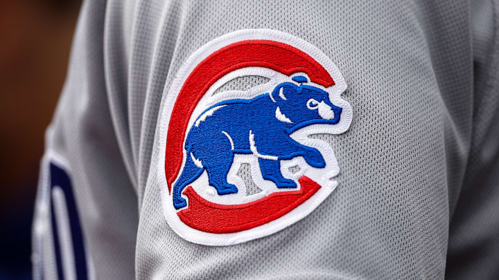
Pinstripes have been a staple of the Cubs' home uniform for the better part of 65 years. What made this era special was the addition of a Cub head added onto the left shoulder. The shoulder patch was accompanied by the traditional Cubs logo as well as stripes. Chicago kept its traditional blue hat and wore appropriate socks to match. Philip K. Wrigley was the principal owner while the Cubs were playing their 47th year at Wrigley Field.

The Cub head is now etched onto modern fan gear, such as hats, t-shirts, sweatshirts, and jerseys. Although a fan favorite, the Cubs' 1962 season wasn't their best. Chicago finished second-to-last in the National League with a record of 59-103. This was the first season the N.L. played a 162-game season.
9. 1979-81 Road Jersey

Two main talking points with this era's uniforms. First, the Cubs implemented a new "C" onto the home jerseys. For the bear logo on the shoulder, designers gave the creature some life. The shoulder patch was given an angry expression.

The three seasons were marred by mediocrity for Chicago, finishing near the bottom of the N.L. East between 1979-81. Nonetheless, the uniform gave some life to fans who were waiting for the Cubs to break through. When you see this uniform, think of Bruce Sutter, Lee Smith, and Dave Kingman.

8. 1941 Road

A lot going on with these jerseys. From the half-sun underline beneath the "Chicago" front to the different shades of blue, this season had a lot of "firsts" for the Cubs. This season was the introduction to the light blue road uniforms. The "C" logo was reworked as well, although it applied strictly to the home unis.

These baby blue road uniforms were added midyear. A trio of red stripes is placed at the base of the 3/4 blue sleeves of the jersey as well. The main portion of the jersey is gray with a red strip running down the sides through the trousers as well. Although the colors clash, it would be a nice blast from the past to see the Cubbies play a fellow old-time N.L. team and take the field with these threads on a Friday afternoon.

7. 1982-89 Road

To say the least, the 80s were a rocky decade for the Cubs. Chicago was anywhere from well below .500 to the N.L. East Champions. These unis featured a solid blue top with white pants. There was a thin red line around the bottom of the jerseys. When I think of Cy Young Award winner Rick Sutcliffe, I think of him wearing this particular uniform.

Believe it or not, 1982 was the first year in the franchise's history that the road uniforms were a darker shade of blue. Previously, the Cubs opted for the baby blue tops or gray. Overall, the new look provided a change of pace for the Cubs and laid a foundation for more blue-centric uniforms moving forward.

6. 1997-Present Road

Although the "C" with a bear cub trotting through is a staple of the Cubs, these gray uniforms have been a mainstay with the franchise for more than 25 years. Besides certain patches worn on the sleeves for differing occasions (MLB commemoration, etc.) these uniforms have remained the same. The only major differences have been the uniform's outfitter (Nike) and the disappearance of Chicago's red-brimmed cap (please bring it back by the way).

The Cubs wore this style when they scored four runs in the ninth during Game 4 of the National League Division Series to stun the Bruce Bochy-led San Francisco Giants to advance to the National League Championship Series for the second-consecutive season. Great memories from a great season. This choice of Cubs thread has undoubtedly withstood the test of time.

5. 1952-56 Home

Simplicity is often compared to boredom. That is what folks see when they are shown a white jersey, pants and not much else going on. This was also the final years of the more Gothic-looking "C" shown on the caps. Moreover, Chicago moved away from the blue outline around the "Cubs" logo and went with a circular outline in the following seasons.

Chicago Cubs' Hall of Fame inductee Phil Cavarretta led the team for two seasons during this span. In terms of team performance, this five-year glimpse was uneventful. The Cubs were in the basement of the N.L. for most of this period. However, there is something about this uniform that brings out utter nostalgia, maybe it's the fact the uniforms were worn more than 70 years ago.

4. 2021 City Connect

Debuting in 2021, the Cubs were one of seven franchises outfitted with the Nike City Connect uniforms. The main goal of this series was to feature different color schemes, typefaces and graphic elements normally worn by the particular team. On the surface, the Cubs' City Connect uniforms color scheme stayed consistent. Different shades of blue and white dominated the look.

Paying homage to the city the Cubs have called home for its entire history, the flag of Chicago is inspired by dark and sky-blue accents. "Wrigleyville" is stitched across the jersey in a lettering style similar to the iconic "Wrigley Field" sign posted above the main entrance. These are simple yet unique. With Nike taking over the outfitting duties for MLB, this is just the beginning of what is to come from the Swoosh.

3. 1997-Present Home

From Friday afternoon first pitches to day-night doubleheaders, this Cubs home jersey remains one of the more popular jerseys throughout the franchise's history. The blue pinstripes pair nicely with the pure white jerseys.

The Cubs clinched their first trip to the World Series in 71 seasons. Despite the historic success of this kit, Chicago also has sore memories while wearing these. In 2003, when left fielder Moses Alou leaped for a foul ball, the infamous event involving Steve Bartman took place.

Fast forward five seasons, a five-run second inning propels the Los Angeles Dodgers to a 2-0 series lead and eventual sweep in the 2008 NLDS. Seven seasons later, the Mets finished off a four-game sweep of the Cubs, crushing any hopes of breaking their World Series drought.

2. 1997-99 Alternate

On the cusp of the new millennium, the Cubs were at the epicenter during one of the most polarizing periods of MLB's storied history. Sammy Sosa, Mark McGwire: long ball battle. Love it or hate it, the summer of 1998 home run in-season derby provided more than enough excitement for fans.

Sept. 23, 1998, Sammy Sosa cranks home runs 64 and 65 at Milwaukee County Stadium. The N.L. MVP was wearing the blue alternate Cubs jersey when he smashed those long balls. When I think of Sammy Sosa, I think of the alternate uniform and him trotting around the bases following a moon shot. This brings back a lot of memories as I was just beginning to not only understand but appreciate the sport of baseball. Nearly two decades later, the Cubs were able to break one of professional sports' most storied curses in a uniform similar to this after winning the 2016 World Series.

1. Ron Santo Era Home, Away and Alternate

This selection comes to honor, celebrate and acknowledge one of the most beloved Cubs ever: Ron Santo. A mainstay at third base during the 60s and early 70s, Santo's No. 10 is retired, only one of seven players to have their number retired by the Cubs. Mildly put, Santo was one of the most consistent third basemen to play at the major league level. Santo's record of 164 games at third base is still a record today. He led the N.L. in total chances every season from 1961-68.

When I envision Santo, I picture his baseball card with his hair falling underneath his cap while wearing the white Cubs jersey with blue pinstripes and the bear shoulder patch. Santo wasn't only a fantastic ball player, but his philanthropy was also a reason for his Chicago fame. He raised millions for the Juvenile Diabetes Research Foundation after battling the disease for his entire life, mostly privately.

Finally, Santo became the first player in MLB history to wear a batting helmet with protective ear flaps. All of these accomplishments were conquered while he was wearing some variation of the Cubs' uniform between 1960-73.

More Chicago Cubs News

feed

Next