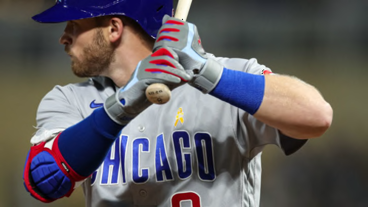
The Chicago Cubs are one of the oldest franchises in Major League Baseball – and, by and large, their uniforms have always reflected that. In the last decade, we saw the team celebrate its century-plus of history in exciting ways, donning throwbacks from different eras, but heading into 2022, it’s back primarily to three looks – with the City Connect looks from this past year returning, as well.
The introduction of those alternate navy blue threads irked baseball traditionalists – but the numbers speak for themselves in terms of sales. But how do they rank among the four options the Cubs cycle through? Let’s take a look and see.
Ranking Chicago Cubs uniforms: #4 – The boring road grays just kill me
If you want traditional, then you’re probably a big fan of the team’s road look. A gray top with ‘CHICAGO’ in block letters across the chest along with the player’s number below and on the back, accompanied by their last name is about as safe as you can get.
I will say – they’re better than those ill-fated alternate grays we saw back in 2014 that had ‘CUBS’ across the chest instead of ‘CHICAGO’ – but that’s setting the bar awfully low, too. Those might have been among the worst jerseys ever. Thankfully, they only lasted a couple years.
I’d love to see the team bring back the angry bear look from the 1980s in some fashion, even if it’s just replacing the alternate logo on the left sleeve. I get that road grays are a part of baseball history and have a special place in fans’ hearts, but, come on – we can do better here.
