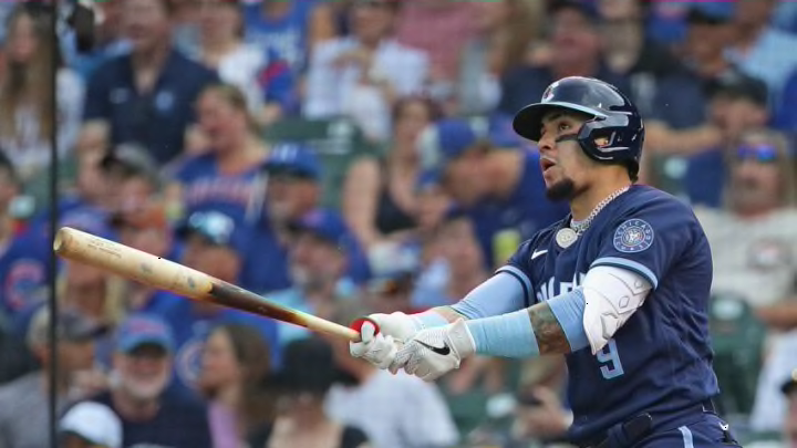
Miami got to debut their version of the City Connect uniform in early May.
Description
This look was designed to commemorate the 1959 Cuban-based Havana Sugar Kings. The Sugar Kings were a minor league team (Triple-A affiliate) that won the leagues championship that year.
The uniform starts with a red jersey with separated white pinstripes with “Miami” across the front in white, outlined in powder blue. It’s the same font the Marlins use on their current uniforms. There is a patch on the right sleeve that is a bag of sugar, and inside it has “MM” inside a crown (for Miami Marlins, and the crown for the Kings). The other sleeve is the Marlins current logo.
Next we have white pants with powder blue piping down the side. The hat is powder blue with a red bill. On the front, it has the Sugar King’s crown in red, and the Marlins logo on the side.
Objective Review
When I looked up what the Havana Sugar Canes actually wore in 1959, I found their look to be very similar to the current Philadelphia Phillies. Fun fact, they were actually an affiliate of the Cincinnati Reds.
These are loud, man. The color scheme is fun and very Miami. They’re definitely playing to the crowd and that’s what these new uniforms are supposed to do. It’s also cool to pay homage to a Cuban team that probably meant a lot to a lot of families growing up close to their and watching baseball. Like Boston, they played to their city and culture very nicely. They connected the city and got a city that normally doesn’t to turn out and watch baseball. Mission accomplished.
