Chicago Cubs: An objective review and ranking of City Connect uniforms

(Photo by Jonathan Daniel/Getty Images)
1 of 9
Next
(Photo by Jonathan Daniel/Getty Images)
(Photo by Jonathan Daniel/Getty Images) /

In the second year as the official uniform provider of Major League Baseball, Nike announced seven clubs in baseball to be the trial run of a uniform line they called City Connect. With the idea that each team would have a City Connect uniform in rotation by the year 2023, the seven clubs chosen to start out with were the Boston Red Sox, Miami Marlins, Chicago White Sox, Chicago Cubs, San Francisco Giants, Arizona Diamondbacks and Los Angeles Dodgers.

The idea of City Connect in MLB really came from the success Nike had in doing the same thing with teams in the National Basketball Association. Popularity and sales for these uniforms went through the roof for both Nike and the NBA, so why not bring it to baseball?

Recent studies had shown popularity and interest of baseball in the younger demographic has been dangerously low, and MLB has been working tirelessly to find ways to make the game less boring and entertaining to the younger fan.

To those younger fans MLB is certainly attempting to cater to, these uniforms are doing exactly what they are supposed to do: increasing popularity, sales, and interest in the game. However, to some older and “more experienced” fans that consider themselves traditionalists and like things the way they are, these uniforms are definitely having an opposite effect.

I consider myself a nice hybrid between a young fan looking for excitement and a traditionalists afraid of changing things I’ve been accustomed to watching and enjoying since I was 6-8 years old. So I feel like I am the perfect judge to objectively review each and every City Connect uniform we have seen this season, and potentially bridge the gap between the young and traditionalist.
(Photo by Billie Weiss/Boston Red Sox/Getty Images)
(Photo by Billie Weiss/Boston Red Sox/Getty Images) /

The Boston Red Sox were the first team to debut their City Connect threads in April.

Description

In honor of Patriots’ Day, a day we now remember and honor those lost in the tragic Boston Marathon bombings in 2013, the Red Sox completely changed their look to the colors of the Boston Athletic Association.

The uniform features a yellow jersey with powder blue lettering. The font matches that of the finish line in the marathon. The jersey also features a patch on the left sleeve resembling a race bib with Boston’s area code in it, 617.

The look also includes white pants with powder blue piping, yellow shoes, yellow socks and powder blue undershirts. The hat is all powder blue, with the classic Boston “B” powder blue with yellow and white outline.

Objective Review

When I first saw these, the traditionalist in me was very loud and passionate in my opposition. The RED Sox were wearing uniforms without ANY red to be found. But then, I was informed of why these uniforms were chosen, and the whole idea and meaning of the City Connect Series (besides making Nike and MLB more money than I could ever imagine) started to click and make sense for me. The fans and the city of Boston really seemed to like these uniforms and what they meant to and for the city, and that was the point of all of this.

And besides, the White Sox have not worn white socks for years. They’re the real liars here.

(Photo by Mark Brown/Getty Images)
(Photo by Mark Brown/Getty Images) /

Miami got to debut their version of the City Connect uniform in early May.

Description

This look was designed to commemorate the 1959 Cuban-based Havana Sugar Kings. The Sugar Kings were a minor league team (Triple-A affiliate) that won the leagues championship that year.

The uniform starts with a red jersey with separated white pinstripes with “Miami” across the front in white, outlined in powder blue. It’s the same font the Marlins use on their current uniforms. There is a patch on the right sleeve that is a bag of sugar, and inside it has “MM” inside a crown (for Miami Marlins, and the crown for the Kings). The other sleeve is the Marlins current logo.

Next we have white pants with powder blue piping down the side. The hat is powder blue with a red bill. On the front, it has the Sugar King’s crown in red, and the Marlins logo on the side.

Objective Review

When I looked up what the Havana Sugar Canes actually wore in 1959, I found their look to be very similar to the current Philadelphia Phillies. Fun fact, they were actually an affiliate of the Cincinnati Reds.

These are loud, man. The color scheme is fun and very Miami. They’re definitely playing to the crowd and that’s what these new uniforms are supposed to do. It’s also cool to pay homage to a Cuban team that probably meant a lot to a lot of families growing up close to their and watching baseball. Like Boston, they played to their city and culture very nicely. They connected the city and got a city that normally doesn’t to turn out and watch baseball. Mission accomplished.

(Photo by Ron Vesely/Getty Images)
(Photo by Ron Vesely/Getty Images) /

Next up were the White Sox showing off their Southside look in early June.

I’m sorry, the picture just had to be Tony La Russa.

Description

The uniforms are exact reverse of the White Sox uniforms we’re used to seeing – black pants and jersey with white pin stripes. Across the front, you won’t see Chicago, but rather “Southside” in gothic script, in reference to and honor of the neighborhoods and communities on the south side of Chicago. The back features white names and numbers, the numbers matching the gothic script as seen the front.

The uniform finishes off with a black hat with “CHI” in gothic script in the shape of their current logo.

Objective Review

The White Sox play on the south side of Chicago at the corner of 35th and Shields, but that is not the main reason for the front of the jersey. The team wants to honor and bring attention to the south side communities, mostly victim to a bad reputation for its crime rate and shootings.

There are thousands upon thousands of good people in these communities and they are proud of where they come from, and as they should be. “Southside” is a mentality and a culture, and these uniforms and the White Sox bring that honor and pride to the ballpark with them every day.

Again, at first, my traditionalist self hated everything. However, after seeing what these jerseys mean to the team and communities they represent, and after learning about why the Sox picked this look, I very much started to come around to appreciate them.

And yet still, another White Sox uniform without actual white socks.

(Photo by Jonathan Daniel/Getty Images)
(Photo by Jonathan Daniel/Getty Images) /

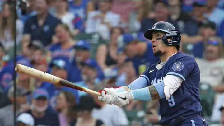
Before the team disintegrated, the Cubs got to debut their version of City Connect in mid-June

Description

The Cubs went with all navy pants and tops for their look. Across the front, they have “Wrigleyville” written in the shape of the red marquee sign at the front o f Wrigley Field in white, and outlined in powder/sky blue. There is a round patch that has Chicago’s “Y” logo and red stars on the inside. The “Y” is to represent the branches of the Chicago River, while the stars replicate those on the Chicago flag. The back has powder blue names and numbers.

The hat is navy with a powder blue bill. The logo is the familiar “C” in white and outlined in powder. In the middle of the “C” there is a red star, again to replicate the stars on the Chicago flag.

Objective Review

As a die-hard Cubs fan that is also a die-hard traditionalist, I wanted to hate these uniforms so badly. When the Cubs are at home, I want white uniforms with blue pinstripes and nothing else. I hated when the team wore the blue tops at home because it looked like spring training.

But again, I am learning a lot about all of these uniforms, and I’m growing as a person. These uniforms honor all of Chicago’s 77 neighborhoods within the city limits. They are heavily influenced by the Chicago flag, the coolest and most iconic symbol of the city. They do exactly what they are supposed to do – connect a city.

My favorite part is the hat. the red star in the middle and the powder blue bill for the flag is such a great look.

I understand my bias is coming out.

(Photo by Norm Hall/Getty Images)
(Photo by Norm Hall/Getty Images) /

The Diamondbacks got to put on their City Connect uniforms for the first time on an early July night in the desert.

Description

The jerseys are a sand color with the word “Serpientes” (Spanish for “snake”) in script across the front. The “S” in “serpientes” is a snake, slithering down and under the entire word. There is a number on the lower left in the Diamondbacks familiar burgundy. The left sleeve has a patch of the Diamondbacks “A” logo in black, and the Arizona flag on the right. The back features a burgundy name and black numbers.

The pants are the normal home white pants for Arizona, and the hat is sand with a black bill and the Diamondbacks “A” logo in black on the front.

Objective Review

The Diamondbacks designed this uniform to pay homage to the desert and the sand covering Arizona, and also honor the state’s Hispanic culture and history. The color makes sense and they are snakes. They did what they wanted to do.

To me, if you’re going to do this, do it big. we saw Boston and the Cubs go all out for their cities. We saw Miami get loud with theirs. These are just sort of… bland. There’s no real flair going on. This is me saying this too, captain of the traditionalists.

I feel like the Diamondbacks could have done better here. These are sort of boring. Honestly, I’m shocked it took me until the fifth team to end on a sour note.

(Photo by Thearon W. Henderson/Getty Images)
(Photo by Thearon W. Henderson/Getty Images) /

The Giants were next to debut their City Connect uniforms in mid-July on the San Francisco Bay

Description

The Giants went with a white jersey and white pants (orange piping down the side), different from the cream color they normally wear. On the front of the jersey is the team’s alternate capital “G,” starting with bright orange at the top and fading into white at the bottom. The numbers on the back do this as well. Both sleeves have the Golden Gate Bridge wrapping around them in orange.

The hat is all orange with the normal “SF” logo in orange and outlined in white. On the right side of the hat, there is another showing of the Golden Gate Bridge in white. All-in-all, they only use two colors: orange and white.

Objective Review

The jerseys are obviously a representation of the Golden Gate Bridge as it appears three different times on the uniforms. However, the Giants also give a little tip of the cap to the heavy fog the city endures with the fading of the logo and numbers on the jersey, a very specific and thoughtful detail.

Do these represent the city of San Francisco? Absolutely, they show the bridge and they’re orange. I understand the concept of representing the fog in the uniform as well, however I will never be on board with changing color numbers or letters on a uniform. I am team solids. And to be honest, these are pretty ugly. It’s a no for me, dog.

Mandatory Credit: Robert Hanashiro-USA TODAY Sports
Mandatory Credit: Robert Hanashiro-USA TODAY Sports /

The Dodgers were the seventh and final team to debut their City Connect uniforms in 2021.

Description

These uniforms are almost a direct inverse of their normal home uniforms. Dodger blue pants and jerseys with small red numbers on the lower left. Across the front in white and the familiar script reads “Los Dodgers.” The left sleeve has the timeless “LA” logo in white. The back has white letters and numbers.

The hats are all blue and read “Los Dodgers” in white on the front, matching the jersey.

Objective Review

The Dodgers wanted to honor their heavy Latino fan base with their look, as they put on Dodger Blue pants and jerseys together for the first time ever. The Dodgers basically took their normal uniforms and turned them blue, and copy/pasted the front of the jersey to the hat. There really isn’t much to dissect with these uniforms, admittedly.

That’s because these are absolutely lazily done. The jersey and hat are exactly the same, which really only works if the jersey is also just the letter logos like the Yankees, White Sox, Tigers, Reds, etc. etc. There are way too many letters to just throw this on a hat.

I can’t imagine what an alternative would be or look like to these uniforms. I don’t have a better solution to what they would do instead. So I will give the designers that. However, this “design” probably took all of two minutes and thirty-seven seconds to come up with. I can’t imagine there were too many sleepless nights to determine this was the final draft.

(Photo by Ron Vesely/Getty Images)
(Photo by Ron Vesely/Getty Images) /

Chicago Cubs: Ranking this year’s City Connect uniforms

We have now taken a dive into each City Connect uniform we have seen in 2021. Seven teams in six cities were given the opportunity to begin a new era in MLB uniforms, and connect their respected fan groups and communities.

More from Cubbies Crib

As I’ve sort of alluded to during this journey, I started as a very grumpy traditionalist when I saw MLB was following in the footsteps of the NBA with this uniform movement. I thought (and still think to an extent) there are way too many uniforms out there. The NBA has at least five per team now, and there is no order or organization in that. No team has a home or away uniform anymore, and sometimes they match the opposing team.

My fear was MLB also becoming too loose with structure in uniforms and the tradition and pastime of baseball would be tarnished for the remainder of my days. The world was essentially burning down.

But, as we’ve learned, that’s not the point.

Things eventually change, uniforms change, the teams even change. Change can be a good and welcoming thing. These uniforms mean something to the cities and communities they are targeted to, that’s the point. MLB is trying to grow the game anyway they can and baseball needs growth.

I would absolutely trade adding a couple new looks for not changing the rules…

That all being said, some of these are terrible and it is my job and duty (given to myself) to honestly and objectively power rank these looks and I will do that right now.

Next. How are the core's replacements faring so far this season?. dark

*As a homer with a heavy bias towards the Chicago Cubs, I will not be including them in the power rankings. This is called honest journalism. (Even though they are easily #1)*

  1. Chicago White Sox
  2. Boston Red Sox
  3. Miami Marlins
  4. Arizona Diamondbacks
  5. San Francisco Giants
  6. Los Angeles Dodgers
Next